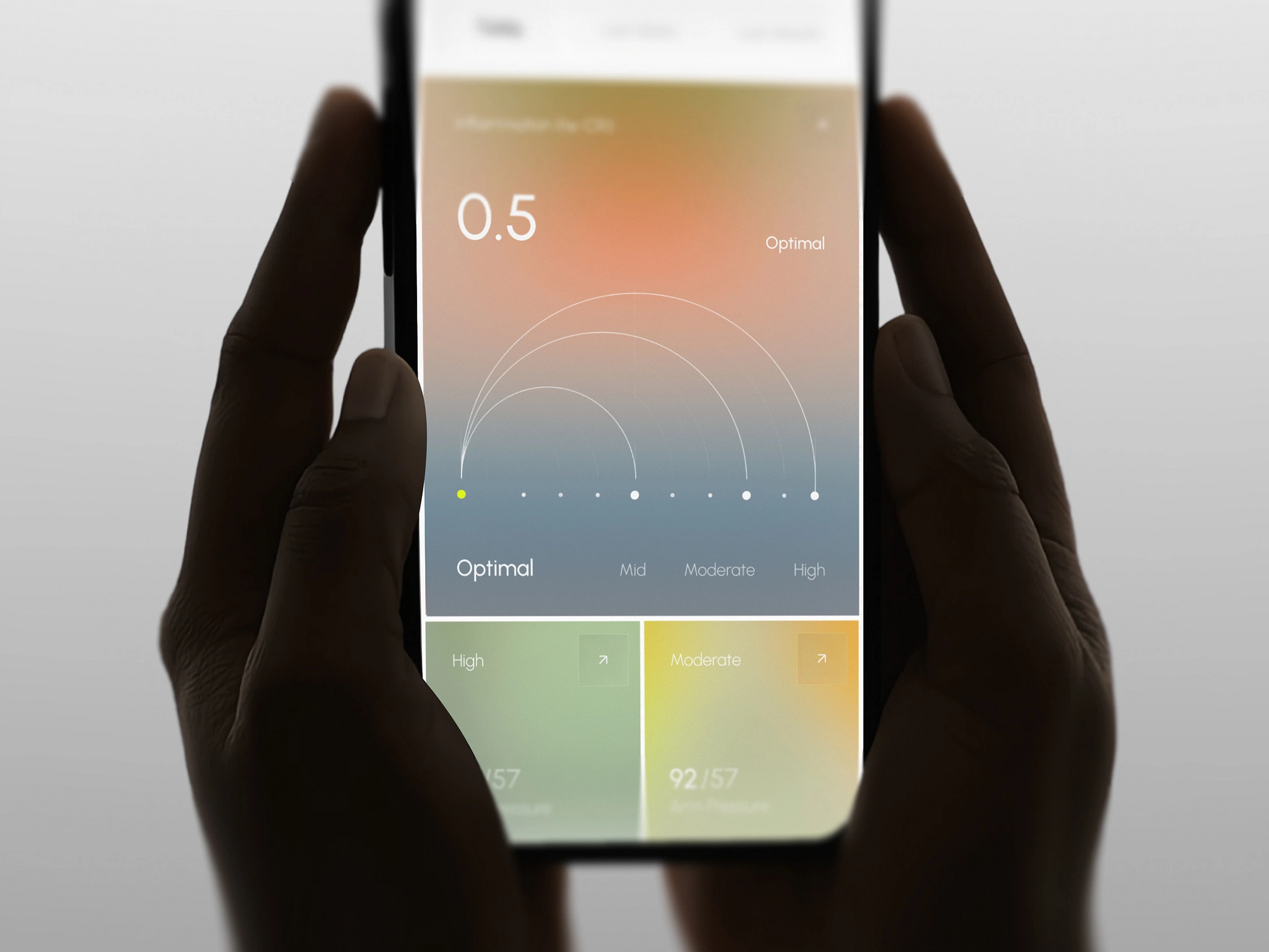
The landscape of UI/UX design is shifting faster than ever. As generative AI matures and novel hardware paradigms emerge, user expectations for digital experiences have reached an all-time high. Modern interfaces are no longer static canvases—they are dynamic, context-aware, and deeply personalized ecosystems.
Whether you are designing a complex enterprise SaaS, a mobile app, or an e-commerce platform, here are the core UI/UX design trends defining digital products in 2024.
1. Generative & Intent-Driven UI
Traditional interfaces rely on predefined user flows. In 2024, artificial intelligence enables intent-driven UI—layouts and components that generate or restructure themselves based on real-time user intent and contextual behavior.
- Dynamic Dashboards: Displaying relevant tools and data metrics tailored to the user's immediate goal.
- Contextual Prompting: Replacing bloated navigation menus with intuitive conversational command palettes (
Cmd + K). - Key Action: Shift your mindset from rigid wireframes to component systems flexible enough to support dynamic state generation.
2. Bento Box Grids & Modular Layouts
Inspired by Apple and popularized across modern landing pages, Bento Box layouts break information into visually distinct, bite-sized rectangular cards with rounded corners.
- Visual Hierarchy: Organizes disparate content blocks into a clean, scannable, multi-column grid.
- Responsive Flexibility: Scales effortlessly across mobile, tablet, and desktop viewports.
- Interactive Micro-Cards: Allows individual cards to house interactive elements like mini-charts, toggles, or live previews.
3. Micro-Interactions & Intentional Animation
Subtle visual and haptic feedback transform ordinary user actions into rewarding experiences. However, modern micro-interactions emphasize speed and performance over flashy decorative effects.
/* Example: Tactile, high-performance button interaction */
.button-interactive {
  transition: transform 150ms cubic-bezier(0.4, 0, 0.2, 1), background-color 150ms ease;
  will-change: transform;
}

.button-interactive:active {
  transform: scale(0.97);
}
- Key Takeaway: Ensure animations finish in under
300msand respect the user'sprefers-reduced-motionsettings for accessibility.
4. Dark Mode 2.0 & High-Contrast Ergonomics
Dark mode has matured beyond simple color inversion. Dark Mode 2.0 focuses on visual comfort, contrast safety, and OLED power efficiency.
- True Contrast Control: Avoiding pure
#000000backgrounds in favor of deep slate tones (#090D16,#0F172A) to reduce visual glare. - Vibrant Accent Layering: Using elevated surface cards and subtle borders (
1px solid rgba(255, 255, 255, 0.1)) to establish visual depth. - WCAG 2.2 Compliance: Prioritizing minimum contrast ratios of 4.5:1 for body text across both light and dark themes.
5. Spatial Computing & Glassmorphism 2.0
With hardware like Apple Vision Pro and Meta Quest 3 pushing spatial environments into the mainstream, 2D design elements are adopting spatial characteristics:
- Subtle Depth & Blur: Utilizing frosted glass layers (
backdrop-filter: blur(16px)) to indicate z-index layering. - Spatial Light Sources: Realistic dynamic lighting and shadows that react to scroll position or cursor movement.
Summary & Actionable Checklist
To build future-proof products in 2024, evaluate your current interface against these principles:
- Is your interface accessible across device modes and vision capabilities?
- Do micro-interactions provide clear visual feedback without delaying interaction?
- Is your information hierarchy clean, modular, and easy to scan?
Which UI/UX trend are you most eager to implement in your product? Let's discuss in the comments below!